When it comes to interior design, it’s often the smallest details that make the biggest difference. While furniture and color palettes get most of the attention, wall art—especially posters—plays a vital role in shaping a room’s personality. But it’s not just the poster itself that matters. How you present it, particularly how it’s framed, can elevate or diminish its visual impact. In fact, the right framing can transform a simple image into a statement piece.
Whether you’re decorating a cozy bedroom, a modern office, or a lively café, framing isn’t just about protection—it’s about enhancing your design narrative. And with tools like a free printable poster maker to stand out, creating and customizing your visuals has never been easier. But once you’ve designed your poster, what next? Let’s explore how the way you frame and present your posters can redefine your space.
Why Framing Matters in Interior Design
Framing may seem like an afterthought, but it directly influences how a poster is perceived. Think of a poster as a photo and the frame as the lens—it shapes focus, depth, and tone. A thoughtfully chosen frame can:
- Emphasize the colors or elements within the poster
- Tie the art into the broader design of the room
- Add structure and sophistication
- Shift the style from casual to refined (or vice versa)
Interior designers often use frames not only for aesthetics but also for cohesion. A black frame can create contrast against a white wall, while a natural wood frame can soften a minimalist space. The right frame doesn’t just complement the artwork—it completes it.
Frame Styles and Their Interior Effects
Different frame styles lend themselves to different design goals. Here’s a quick rundown:
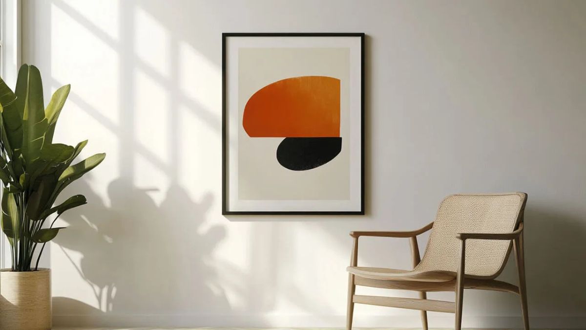
1. Minimalist Frames
Thin, metal, or simple black-and-white frames are perfect for modern and contemporary interiors. They keep the focus on the poster and align well with sleek furniture and clean lines.
Best for: Scandinavian, Industrial, or Urban Modern spaces.
2. Ornate Frames
Heavy, decorative frames work best in traditional or eclectic interiors. They bring drama and elegance, making even simple posters look luxurious.
Best for: Vintage, Victorian, or Maximalist interiors.
3. Floating Frames
These allow the poster to “float” between clear acrylic or glass panels, creating a clean, gallery-like effect. They’re ideal for showcasing bold art or typography posters.
Best for: Contemporary, Artistic, or Transitional spaces.
4. Natural Wood Frames
Warm and earthy, wood frames add a natural, inviting element to the room. Lighter woods evoke a beachy or boho vibe, while darker woods feel more rustic and grounded.
Best for: Bohemian, Coastal, or Rustic interiors.
Poster Placement and Grouping: Elevate the Presentation
Framing is just one part of poster presentation. Where and how you hang your framed posters can make or break the design. Consider these tactics:
Gallery Walls
Group several framed posters of varying sizes to create a curated gallery wall. Stick to a color theme or topic—like travel, nature, or quotes—to keep it cohesive.
Symmetrical Arrangement
Use identical frames and sizes in a grid or linear layout for a clean, polished look. Ideal for offices or formal living areas.
Leaning Frames
Place larger frames on the floor, leaning against the wall, or on top of sideboards. This casual style works well in relaxed spaces like studios or bedrooms.
Unexpected Spaces
Don’t ignore bathrooms, hallways, or kitchens. A well-framed poster in an unexpected spot can add charm and uniqueness to underused areas.
The Psychology Behind Framed Posters
Research shows that framed visuals are perceived as more valuable and intentional. In one interior design study, participants rated framed art as more “complete” and “aesthetically pleasing” than unframed art, even when the content was identical. This highlights how our brains associate framing with professionalism, care, and permanence.
Framing also helps set the tone—metal frames suggest modernity and coolness, while wood evokes warmth and tradition. This emotional connection is why your framing choice should align with the mood you’re trying to create.
Quick Tips for Poster Framing Success
- Match the frame to the room’s vibe, not just the artwork.
- Don’t overcomplicate—let the art speak.
- Use mats (borders) for added elegance, especially for smaller posters.
- Hang at eye level (around 57–60 inches from the floor to the center of the frame).
- Mix textures and sizes if creating a gallery wall, but maintain a common theme.
Final Thoughts: Frame with Intention
In interior design, framing isn’t just a finishing touch—it’s a design decision in itself. It has the power to spotlight, harmonize, and even reshape the story your walls tell. So, the next time you create a beautiful piece using a free printable poster maker to stand out, remember: the right frame will do more than support—it will enhance, transform, and inspire.
Let your walls speak volumes. Frame wisely.